Tricks to Creating Eye-catching Event Signage
An excellent event sign can be more influential than you think! Read more here to learn six tips and tricks to creating eye-catching event signage now!
Do you have an event coming up? If so, you may think of putting out some signs to inform the public. You don’t want just event signage though. You want the kind that draws people in!
Like in other forms of successful marketing, you must use a little strategy with your signage.
How do you keep your signs from being boring and uninteresting? Keep reading to find out! Here are six tips and tricks for creating event signage that people will love.
Style Your Text Correctly

Eye-catching event signage – while colors and other visual elements of your signage may initially draw the attention of passers-by, the text tells your audience all about your event.
There are several things to consider when choosing your text’s style. Don’t go too small or too complicated. Overly wordy signs will probably not get entirely read. And if your text is too small, people won’t stick around to see what it says.
Instead, say what you need to say in only a few words. Use a font that’s easy to read and large enough to be learned from a distance.
The easier your sign is to read, the better your sign is. You’ve got to get your message across in only a second or two. Make the first impression count.
You may want to emphasize your main point in a larger font. “Free Food!” could be the largest text on your signs if you’re promoting a free community dinner.
Once that’s grabbed attention, you can explain where, why, and when the food is free in a slightly smaller font. Just remember to keep the details clear, easy to read, and to the point.
For a wide selection of indoor signs for purchase, explore options from reputable signage providers that offer customizable solutions to fit your specific needs. They specialize in creating signs that are not only visually appealing but also effectively communicate your message to your target audience.
Choose Appropriate Colors
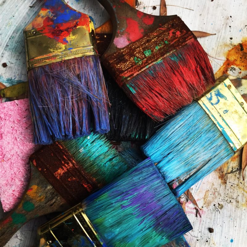
Color is powerful. It can grab attention, send a message, or even create a mood. Your sign’s color scheme should be reflective of the message you’re trying to send. Are you advertising a fun summer event? Use vibrant, bright colors such as lime green, bright yellow, or sky blue.
If you’re hosting a political event that’s meant for discussing serious topics in the local community, a more subdued color scheme could be appropriate.
Even if you’re not promoting a fun, upbeat event, make sure your colors are noticeable. A mix of drab colors like gray and white won’t grab anyone’s eye. Colors like white and gray can be used to accent other colors, but they likely won’t attract much attention on their own.
Consider Location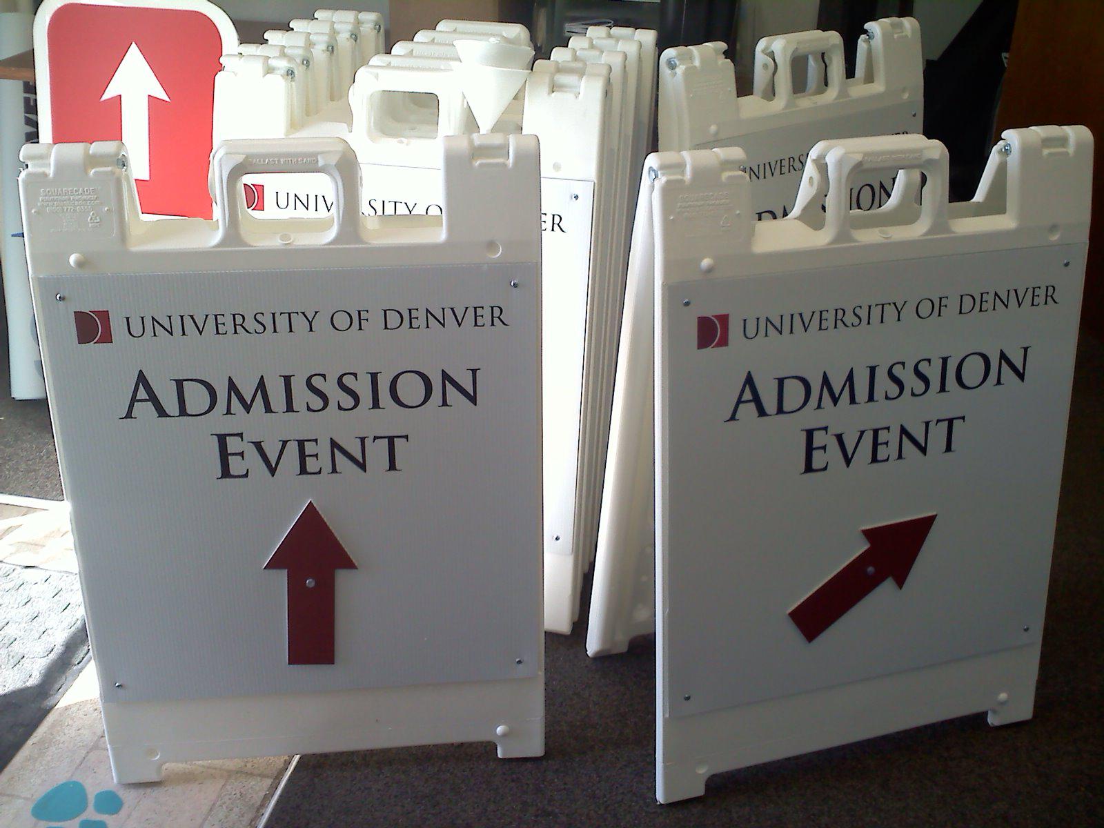
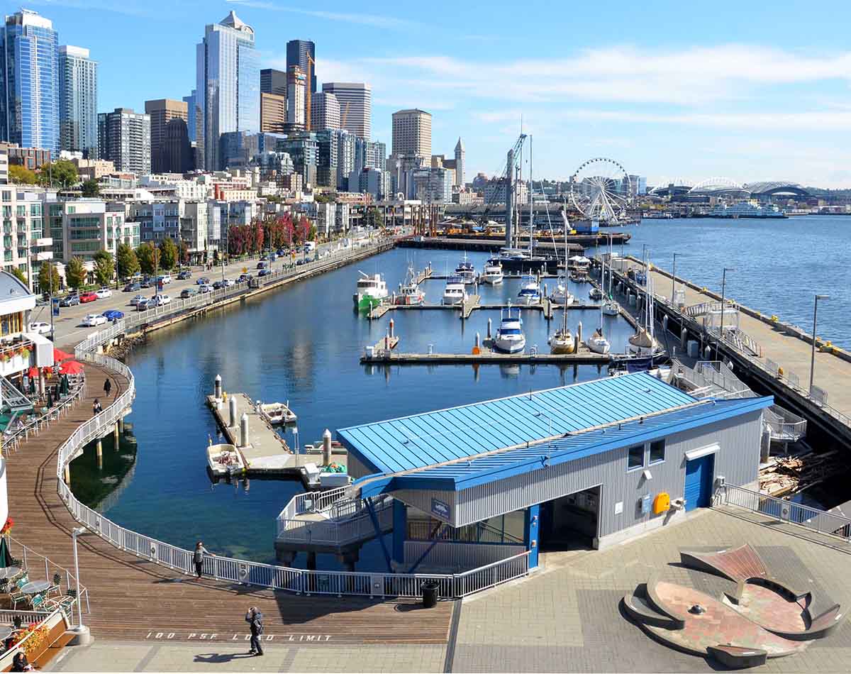
Where do you plan to put your event signs? This information should play a part in how your design your signs. If you’re putting an advertisement on a billboard, you need something that is large enough to fill the space, but not so complicated that it can’t be read in a glance.
You may not want to use a billboard, though. Non-traditional advertising locations can be powerful too. Have you considered advertising your event on floors and staircases? If you’re intrigued by the idea, read more here. Wherever you plan to advertise, make sure your sign design matches the size and scope of the location.
In-Event Signs Don’t Have to be Boring
You need great signs to get the word out about your event. Have you considered the signage needed during your event? Depending on the size of the event and the location where you’re holding it, you may need several types of signs. These may include traffic directors, parking sections, directions to restrooms, and more.
Don’t put a ton of effort into your advertising signage just to have boring signs during your event! Make your in-event signage fun and eye-catching to create a better experience for your attendees.
Are you holding a marketing event? Shake things up by including some poorly designed signs, then use them later as a teaching opportunity. Did anyone notice how drab they were?
Use Contrast
Too much of the same thing is, well, too much of the same thing. You won’t grab attention nearly as well if your signs seem like one big blur. Instead, add contrast to your design. The easiest way to do this is through color.
Don’t use a white font on a light background. It simply won’t get noticed. A solid white font on a deep red background though? That’s a difference that will draw peoples’ eyes.
Use Your Surroundings
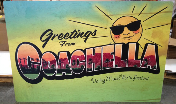
Depending on your venue, using the surroundings to help with sign placement can be a clever and fun trick. Is your event outdoors? Use signs, flower beds, or bushes to hold your signs. The height and location variety will be way more fun than a bunch of signs on poles.
If you’re hosting an indoor event that uses barriers or funnels to direct traffic, use those spots to place your signs! You can even use tabletops or chairs if you have a lot of those around. Get creative and see what you can come up with!
Use These Tips for Great Event Signage
Great event signage is the first step towards having a great turnout. You can put all the effort you want into creating an amazing event, but if people don’t know about it you’re sunk!
Use these tips and tricks when creating your event signage if you want to grab attention. You’ll create signs that are fun, eye-catching, and easy to understand.
Creativity adds a big punch to signs that could be boring otherwise. Don’t be too complicated, but get creative and see where it leads you!
Are you interested in learning more about other methods of advertising? Check out our article on mobile app marketing trends.

