The Truth Behind the Psychological Success of UI/UX
Even though not all people are fully aware of that, both UI and UX design uses various psychological tricks to create all kinds of incentives that influence our behavior.
Most of the commonly used methods attempt to make the experience of the user smoother, while also trying to convince him to follow with some actions.
If you are interested in working as a UX designer, you can check out Career Foundry.
In a second, you’ll learn about some of the phenomena that are often applied in UI and UX.
The Abundance of Choices
Even though theoretically, the greater the range of choices available for the user should result in greater consumer satisfaction, the data tells a different story.
If you are faced with too many options, you will spend significantly more time on considering all the available choices.
It might be that after a long consideration you decide not to buy anything at all.
That’s why it is crucial not to present too many alternatives, as it might actually decrease the number of products sold.
Even if potential customers acknowledge that they would greatly benefit from the product that can be found on your website, if there are too many models available, they might conclude that none of them look exactly right.
Sometimes less is more. Our brains process the information differently when they have to produce an answer instantly, and when our conscious mind is involved in the analysis.
Not every element is Equal!
If there are any long lists on your website, you should remember that most of the users who visit your website will skip most of the elements, and focus only on the first element and the last one.
Long lists are boring, or that’s what most people think, therefore to save time, they reduce the amount of time spent on reading them.
It means that if there are some products or pieces of information that you would like to be clearly visible, then put them either at the beginning or at the end.
Unfortunately, the elements that are located in the middle will be missed by the majority of people.
If you think that every element on the list is equally important, you should consider presenting the information without using lists.
We notice the Difference
Another way to attract the attention of the users is to create a difference.
If you place nine similar elements on a page and add one element that will differ from the rest, then the visitors will focus on the one piece that doesn’t fit with the rest.
Similarly, when the appearance of the elements that we already know changes, we quickly notice the change.
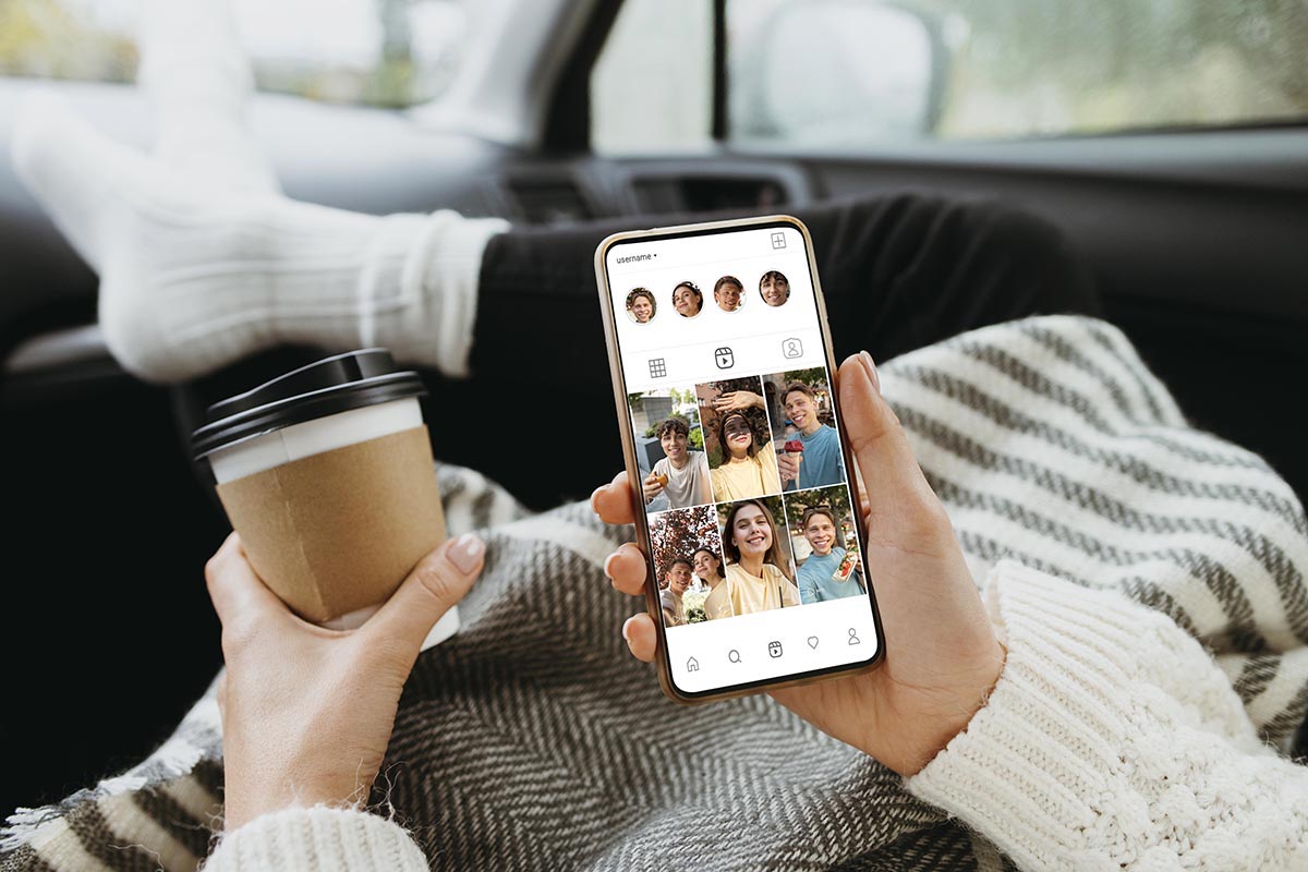
Most of the social media apps have a fairly simple but effective design.
When you receive some messages, a small yet noticeable number will let you know that you should click it.
You might not always know what has changed, but your brain will quickly discover that something is different.
A smart design will try to use this curiosity to encourage users to take specific actions.
The power of Priming

Priming is another technique that is used by designers to influence our decisions. How does it work?
If you watch sports on TV, some of the areas that are responsible for physical movement are activated.
That’s because we are social creatures, and throughout millennia, we have learned to empathize with others. If you see that a friend of yours is hurting, then you will feel bad as well.
Similarly, if you look at people who are happy and motivated, then your attitude will change for the better.
Researchers have found out that even reading words that we associate with being old affects our walking speed.
If you consider all those facts, then you’ll realize that smart design can affect the decisions made by visitors.
At the same time, you shouldn’t use Priming too intrusively, or the visitors might feel uncomfortable.
Remember that although you want to increase sales, you also want to create a design that will be friendly and relaxing.
The Charming Prince vs. Ugly Witch
Although you might think that when it comes to UI, the usefulness of the design reigns supreme, it is not always the case.
Humans have a tendency to associate beauty with positive characteristics, and conversely associate ugliness with negative characteristics.
How can it apply to the UI? The researchers have found out that a design that has flaws, and makes the user experience worse, but is esthetically pleasing will be rated as superior to the one that is functionally the same but looks worse.
It means that making sure that the visitors don’t experience any problems is crucial, but you shouldn’t underestimate the esthetic value.
Even if the website of your competitors isn’t as well designed as yours, but it looks better, it might fare surprisingly well.


