A Complete Guide to Creative Marketing Fonts
Have you ever wondered if your marketing choices make people happy? Good typography does make people happy.
If people are happy with your choices, such as creative marketing fonts like straight outta Compton font, they’re going to have a positive branding experience.
That’s something money can’t buy, right? No matter how many PPC campaigns you do, if it doesn’t look good, people will close the tab and move on. How can you choose fonts for a creative marketing strategy and still have people like them? Making it readable and legible (yes, they’re different things) depends a lot on effective and creative font choice. Readable and legible content, no matter how short or long it is, is enjoyable content. Time to be bold—read on!
Different Strokes for Different Folks
When talking about fonts—typefaces, as they’re known in the field—there’s no one-size-fits-all choice. Not only will you and your customer differ on what is a “good” font, but you’ll clash with your design team as well.
Not everyone has the same opinions about fonts, professionalism, and even what creativity means. It doesn’t have to be an uphill struggle, though. If you have a design operations team, these considerations will be easier.
Your design teams, and those leading them, have extensive experience and training when it comes to good typography choices. There are three areas of type design to worry about. Namely, these are:
- Sans Serif
- Serif
- Display
We’ll go through each detail with some suggestions for good options for creative marketing fonts to consider for your marketing ideas.
Are You Stuck in the Sansbox?
Sans, as you may know, means “no” or “without.” In the case of “sans serif,” it means without serif. Serif is the term for the little legs at the ends, or terminators, of a letterform. Sans serif fonts, like Helvetica, are seriously popular today for many great reasons. First and foremost, pixels tend to be square and geometrical.
Due to this, sans serif fonts have exploded in the digital world as a sharp and clear way to express letters. Long before a screen, starting in the 1800s, sans serif was part of the “modern” movement of type design and letterpress.
It allowed for small text without being too cluttered by the little serif legs. At small and condensed sizes, serifs would create visible lines and distraction across a block of text, and you would lose clarity and legibility.
The same is true on a small screen. Now, however, not only are our screens getting clearer, but we’re able to make better, larger, stronger screens for our mobile devices, including tablets. Three typefaces which are good picks for sans serif designs are:
- Helvetica Now
- NewsSans
- DIN Next
These three will cover almost any major design choice and unify display text or blocks of text (for example, on a poster, product box, or bus stop ad). None of those are on a phone or tablet. That’s not to say they won’t be perfectly at home on the above-the-fold section of a blog or company page.
There’s a New Serif in Town
Serifs, designed to give structure and direction to text, are not just reading blocks of text on paper. In fact, one thought on the origin of the serif is from the Romans.
The Romans used serif typefaces chiseled into stone to prevent weathering and crack at the ends of a cut. Just as it is dangerous to assume that sans serif is just for digital, it is equally dangerous to assume that sans serif is dated, boring, and non-technical and so relegated exclusively to non-digital use.
Serif can be an effective marketing tool to instill feelings of firmness and structure in your brand or what you have to say. It brings authority and sophistication. It isn’t often as “edgy” as sans serif tends to be, but there is no less creativity or whimsy than you can have in sans serif typefaces.
The 1960s and 1970s used serif to great effect in callouts and display, which are not the typical realm of serif fonts since as far back as the 1800s. Imagine if “TIME” magazine didn’t have serifs. Would it have the bold statement and authority it does? Probably not. Some other bold examples:
- Recoleta
- Harriet
- Noto Serif
Recoleta is a good example of an aesthetically pleasing serif font used for callouts and general titles or headers on a website. Harriet is a little more all-purpose with many different styles in the font family.
Noto Serif, created by Google, is a great slab serif for great readability and legibility in a logo or a block of text. Whatever you decide, serif will be here for ages to come.
To Display or Not Display? That is the Question
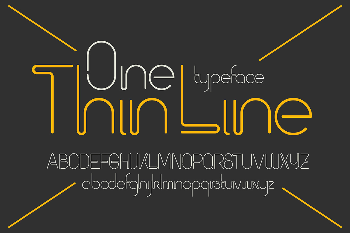
Display fonts are usually used for headlines and headers, product names, callouts in blogs or magazines, and other large-size uses. Display fonts are a little limited in that they are not meant for more than a few words.
Display fonts are only to be used to draw attention. We’ll say again: only to draw attention. That being said, display fonts are some of the more free and creative of the three types.
The digital age has sparked an inferno of creativity in foundries and solo typographers around the world. The easier-access software revolution of the 2010s has virtually eliminated the barrier to getting into the field as a lone type designer. Our top three picks for display style fonts are:
- Mandalika
- Ambiguity
- Lazy Hand
Why these three and not others? Usability. Whimsy is good, but not if it goes off the deep end. These three fonts can be used in more ways than you can shake a calligrapher’s jealous nib at.
Creative Marketing Fonts: The Last Word
It’s too bad there’s no goto box of creative marketing fonts to pull from. As we’ve gone over, the reality is to look over hundreds or thousands of fonts and choose the best fit for your product, campaign, logo, site, app, etc.
That’s why it’s imperative to use a designer who has been taught what to consider and look for in typefaces. Why reinvent the wheel when someone already has extensive knowledge and experience in making them?
Whether it’s business or adventure, our blogs and articles have you covered. With various interesting topics and information you need, we’re sure we’ll be your number one source. Browse our newest topics today.


