Service Interface Design, UX/UI Design
Interface design is my main specialty. Over the years, I have understood an important thing that sometimes has to be communicated even to clients. The most important thing in the design of interfaces is not the design itself. The main thing is to study and understand how people interact with it. It is necessary to analyze what will work and what will not work constantly.
UX Design
UX design can be called design in terms of the original meaning of the word design. Design is, first of all, the development, design, and the result of the headwork. UX design starts with research and analytics. Before I design something, I study the company, its product, competitors, and industry. The important point: without a good product, it is useless to make a good design.
Desktop application, ARM interface, cash terminal, ATM interface, cryptocurrency exchange design – each development of the interface should begin with collecting information. At the very least: the target audience, the reasons for its dissatisfaction, as a product can solve people’s problems.
I had to develop interfaces for Smart TV and geo navigation services. You need to understand where and how the interface will be used and what restrictions the platform has. On the other hand, it is the best way to apply the skills of designer and analyst.
Prototyping interfaces
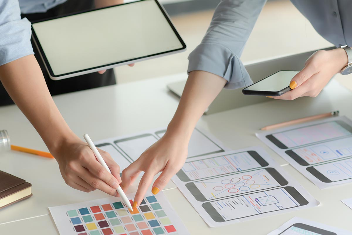
The interface prototypes I make in Axure RP. Today it is the standard of the UX design industry. At the same time, I study Figma. The Sketch was inconvenient for me personally. Figma has a direct export of layouts in zeplin. For most developers of digital services, this is the most convenient option.
If Sketch/Figma isn’t principled, I work for the Xara Designer Pro X editor. Sometimes I show layouts in the InVission service. You can show minimal animation of components and transitions on it. These interface prototypes give the customer a good idea of the final product.
UI interface design
I pay close attention to detail and the grid. Smooth structure and pleasant little things catch the eye and create a pleasant impression on your visitors. In the interfaces of complex digital services, draw different states for buttons. Sometimes I create a UI kit separately for substantial projects.
Interface design work plan: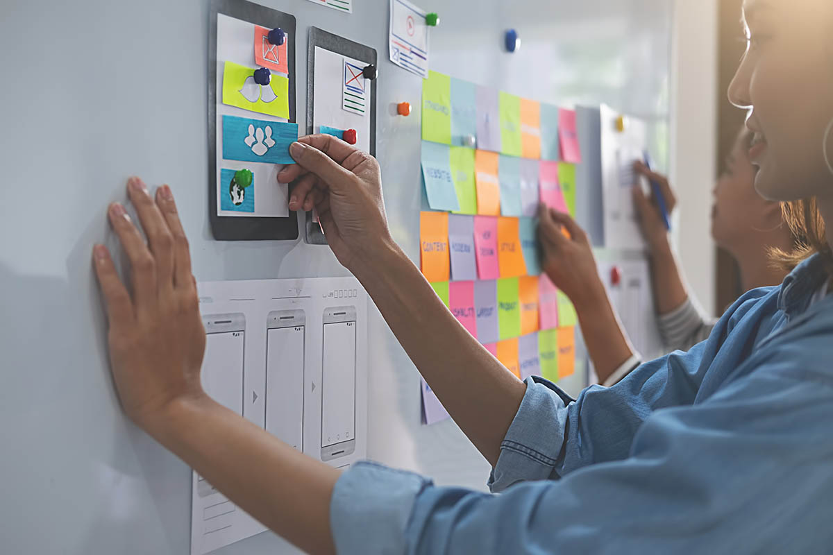
- Check out my works, make sure you like them;
- Request and transfer of materials;
- Prepayment 50% (in some cases 100%);
- Interviews, information gathering, and analytics;
- Development of black and white interface prototypes;
- Interface design in color;
- After approval of all layouts – the remainder of the amount;
- Preparation and transfer of sources in * .PSD format;
- What I do and what I don’t do;
- Auditing the current resource.
As part of the work on the project’s redesign, I first conduct an audit of your resource. I describe the pros and cons from a design and UX perspective.
Result: a document with description and recommendations.
Research
Research is an essential part of the project. Before starting any business, be it building a house or buying a new car, you need to collect information, compare important characteristics and make sure your assumptions.
Result: a profile of the target audience and a description of the goals of the visitors.
Design
You can, of course, build a house without a plan. You can download anything from the Internet. But when you pay a lot of money, you want to get something more individual and thoughtful. This is exactly what I do: I develop an individual structure for pages and blocks.
I design the structure into interactive black and white prototypes. By the way, unlike the drawings of the same house, the site’s prototypes can already be used – walk through the pages and study the routes of visitors. And it’s also a great way to save time and sometimes money.
Result: prototypes of the ordered pages that you can walk on.
Design
Actually, at this stage, the study of the entire visual component of the project is done. Development of a visual language. It’s like a loft-style room or a Provence-style kitchen – you already roughly understand what elements are used and how people react to them.
Next, I select the colors and fonts (the Google Fonts library provides a rich selection today). A rare site does without icons, so I also take them into account. Result: after accepting the design of the pages, I prepare the source files. And not anyhow, but with knowledge of the matter. All layers are put into folders and signed. Neat and efficient. So your developers will be pleasantly surprised.
